Kevin’s Coaching Page | July 2025
Hello again, Lane! This update is a little delayed due to a vacation, but thank you again for this coaching opportunity. I said this last time, but I’ve seen a huge shift in what I notice when I’m studying a pose and I’m gradually seeing improvements in my drawings thanks to your feedback. It’s very exciting!
Looking back at my drawings from the past month or so, I don’t think I have a set of specific questions or focus areas for feedback to ask about, but there are a few themes that have come up that I’d love to share.
Atmospheric shadows
I found your post about shadows to be extremely helpful – this style of value treatment is part of what drew me (and many others, I’m sure) to your work when I first saw it. I could recognize it in a drawing but didn’t quite understand how to apply it myself. Understanding the breakdown of keeping the shadows light and then increasing contrast in focal areas helped me try it out.
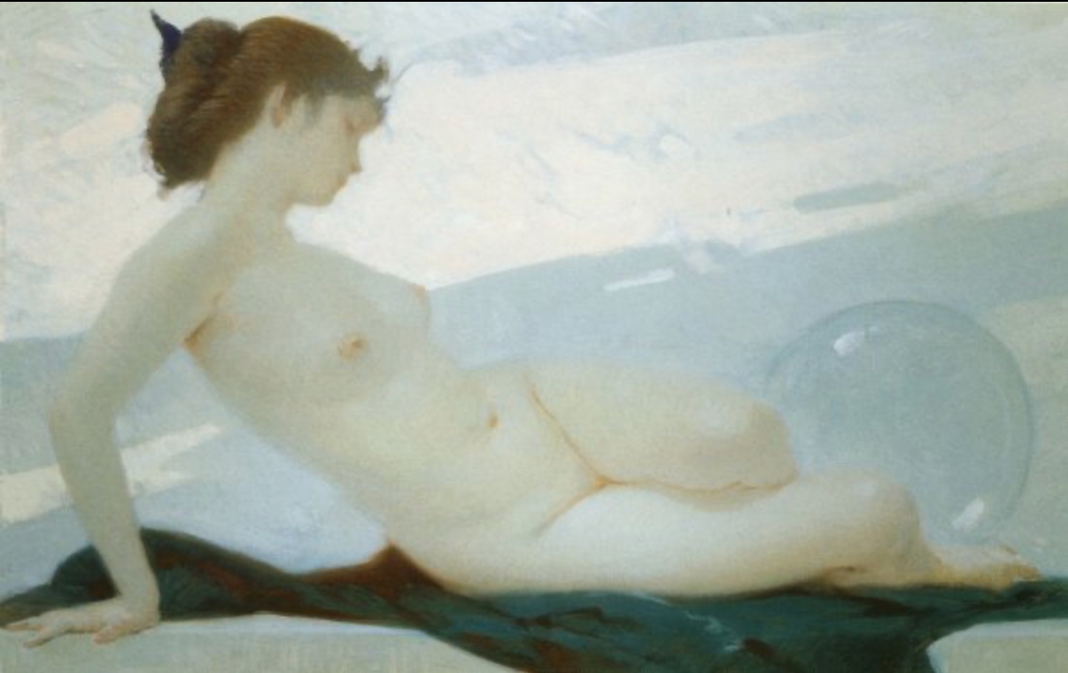
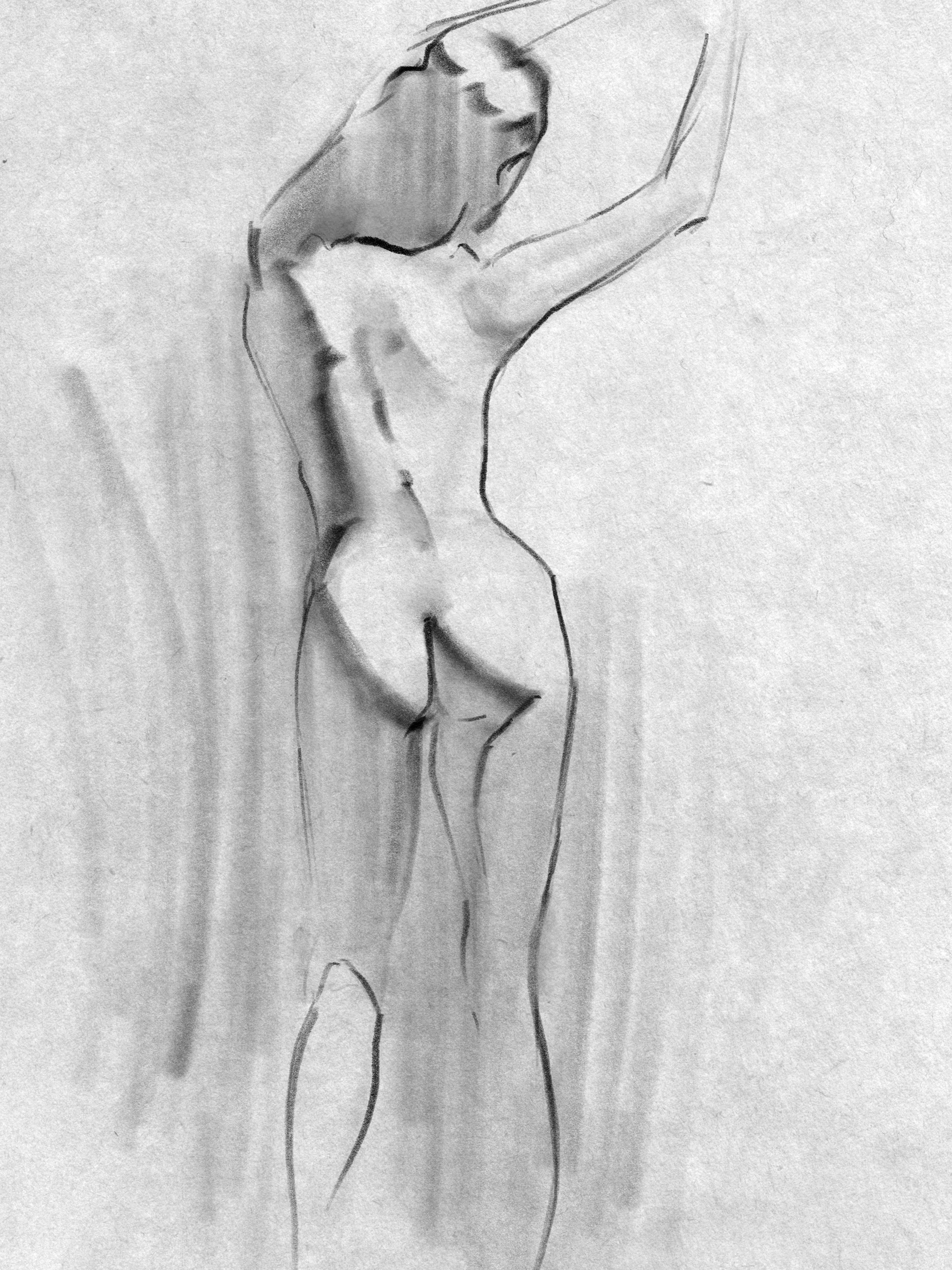 A practice figure sketch after reading the post to try out the ideas. Didn’t keep track of the reference unfortunately! Procreate and Charcoal Master Pack.
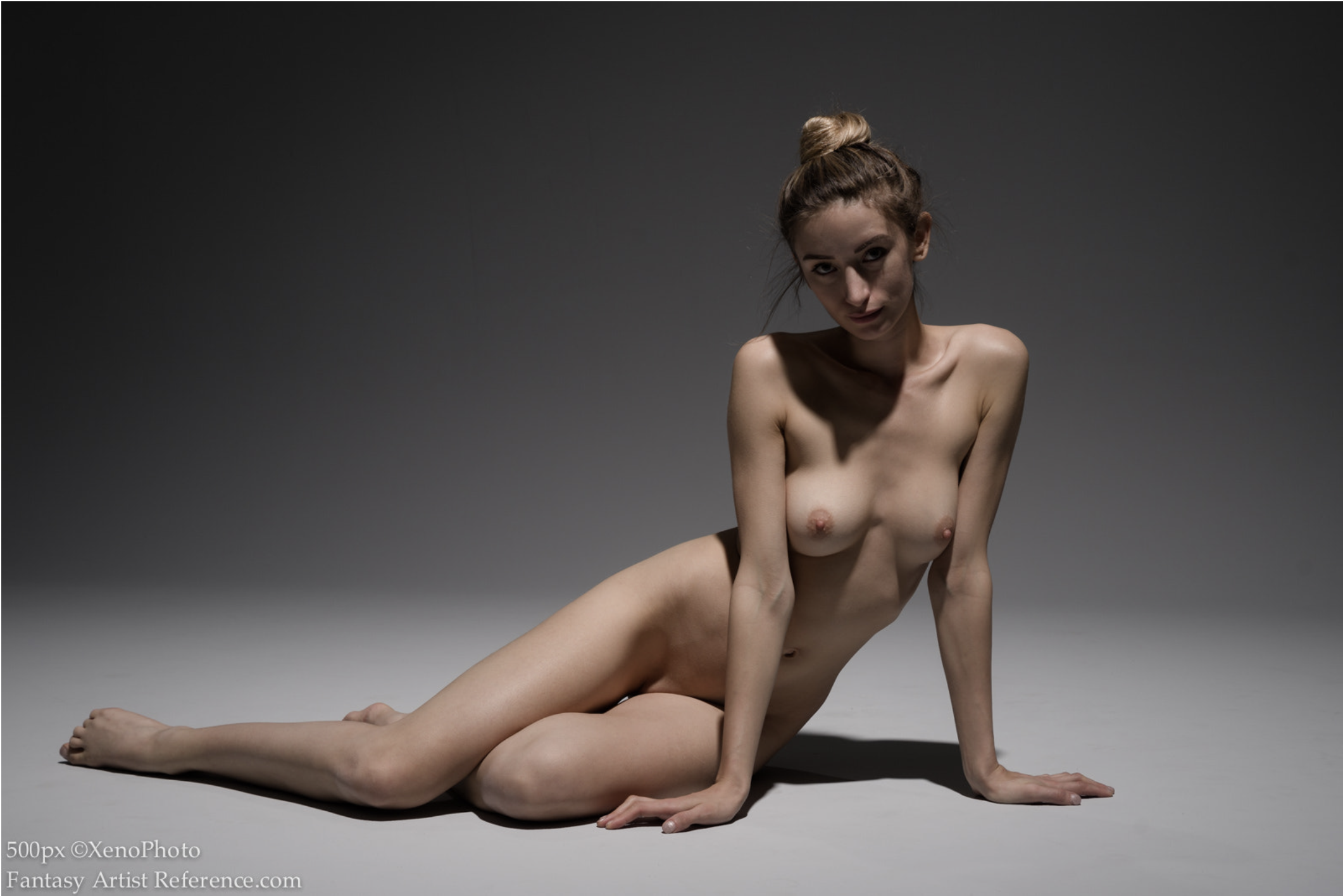
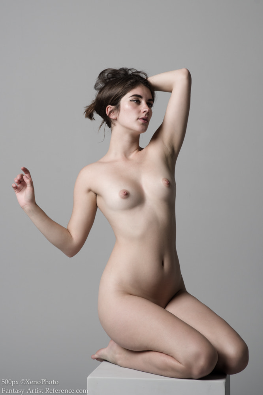
! Procreate and Charcoal Master Pack.](https://res.cloudinary.com/db5mnmxzn/image/upload/v1754399438/IMG_0607_fn9uws.jpg) I sometimes draw portraits from the Draw Me or Reddit Gets Drawn subreddits where people post photos of themselves for references, this reference is here! Procreate and Charcoal Master Pack.
I sometimes draw portraits from the Draw Me or Reddit Gets Drawn subreddits where people post photos of themselves for references, this reference is here! Procreate and Charcoal Master Pack.
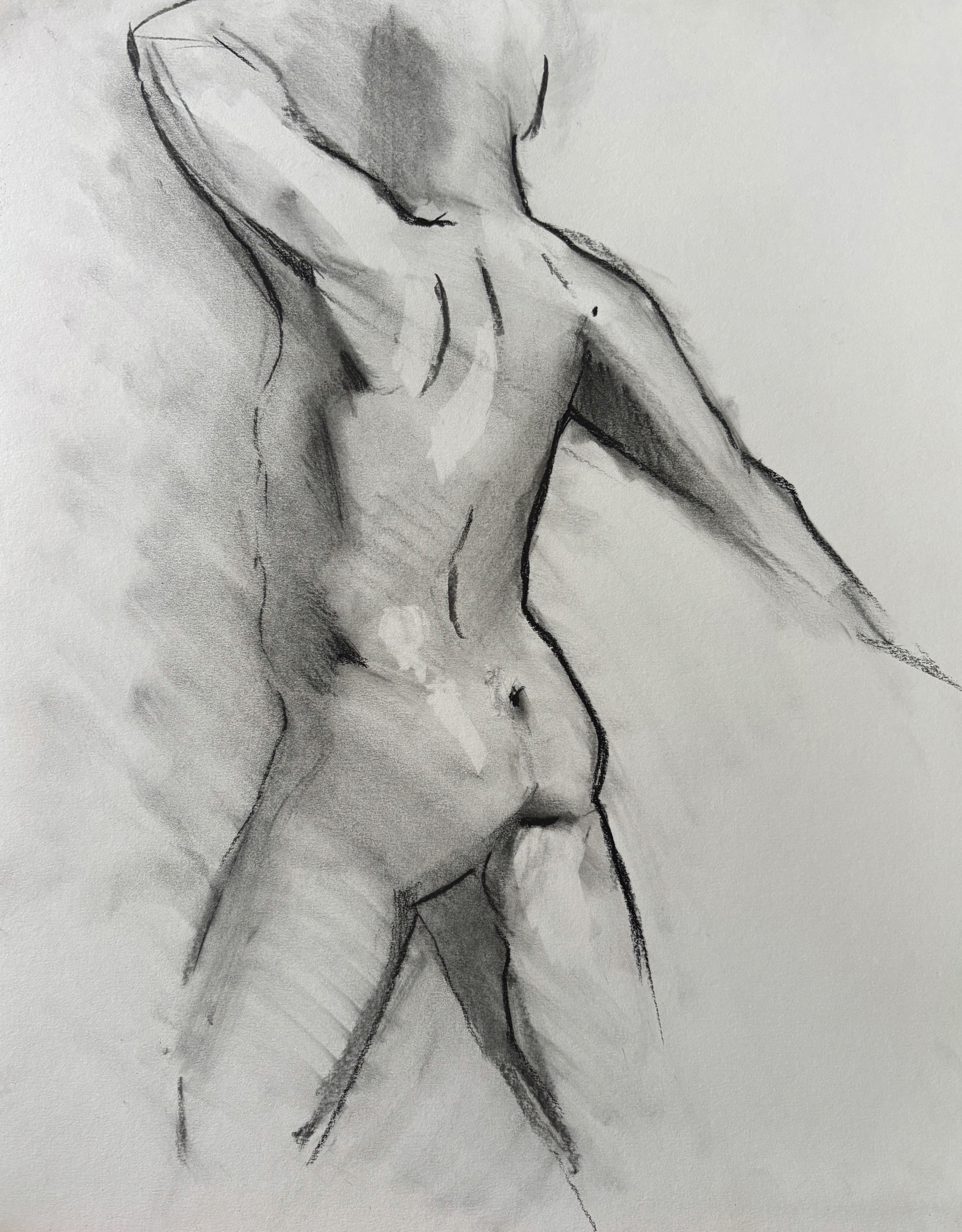
! Charcoal pencil, newsprint.](https://res.cloudinary.com/db5mnmxzn/image/upload/v1754399425/IMG_7041_vvekow.jpg) From one of my in person life drawing sessions, I was directly inspired by the design of your drawing! Charcoal pencil, newsprint.
From one of my in person life drawing sessions, I was directly inspired by the design of your drawing! Charcoal pencil, newsprint.
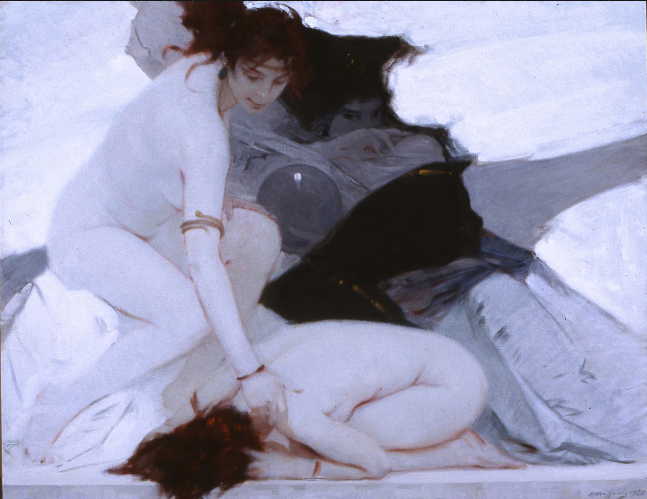
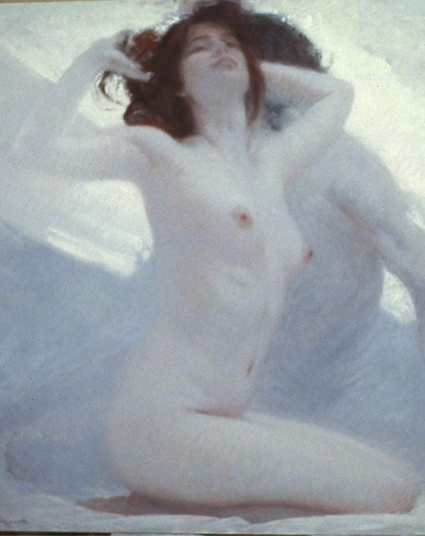
.](https://res.cloudinary.com/db5mnmxzn/image/upload/v1754400635/IMG_7384_1_watuim.jpg) More recent drawing with some atmospheric shadows. 11 x 14 in., vine and charcoal pencil on drawing paper. Reference.
More recent drawing with some atmospheric shadows. 11 x 14 in., vine and charcoal pencil on drawing paper. Reference.
 11 x 14 in., vine and charcoal pencil on drawing paper. Didn’t keep track of the reference…
Another style…
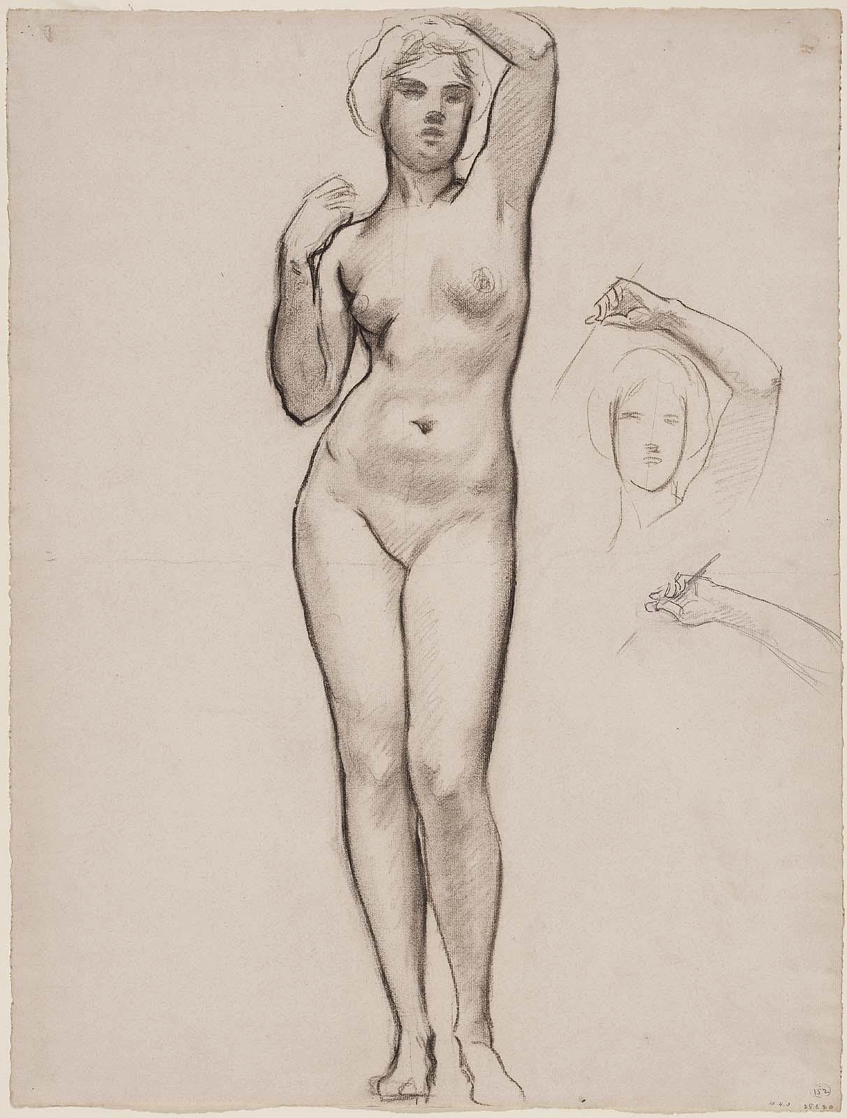
I’m curious for your perspective on another style of figure drawing that I’ve been drawn to. I see it as a kind of opposite approach to the more atmospheric and shadow / value driven style above. The best I can describe it is that it’s more line / contour driven with very subtle indications of value changes around internal structure. Here are a few examples: Example 1, Example 2 - Sargent.
Sometimes I try to emulate this style myself but I haven’t found many more contemporary examples:
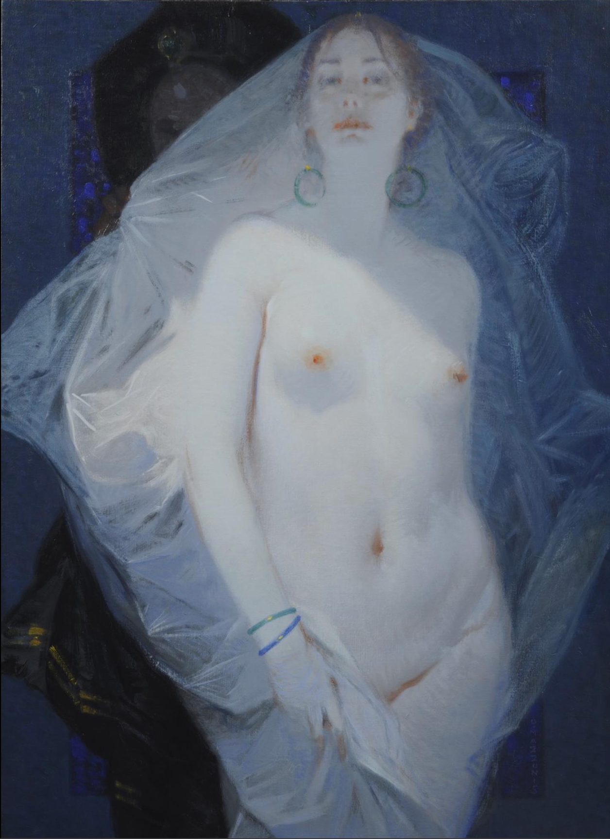
.](https://res.cloudinary.com/db5mnmxzn/image/upload/v1754401626/IMG_7399_1_nlup7a.jpg) 11 x 14 in., vine and charcoal pencil on drawing paper. Reference.
11 x 14 in., vine and charcoal pencil on drawing paper. Reference.
Just curious if you’ve noticed this style or have tried it yourself, or if you can think of any other artists who work this way!
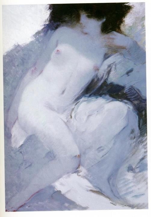
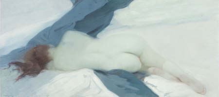
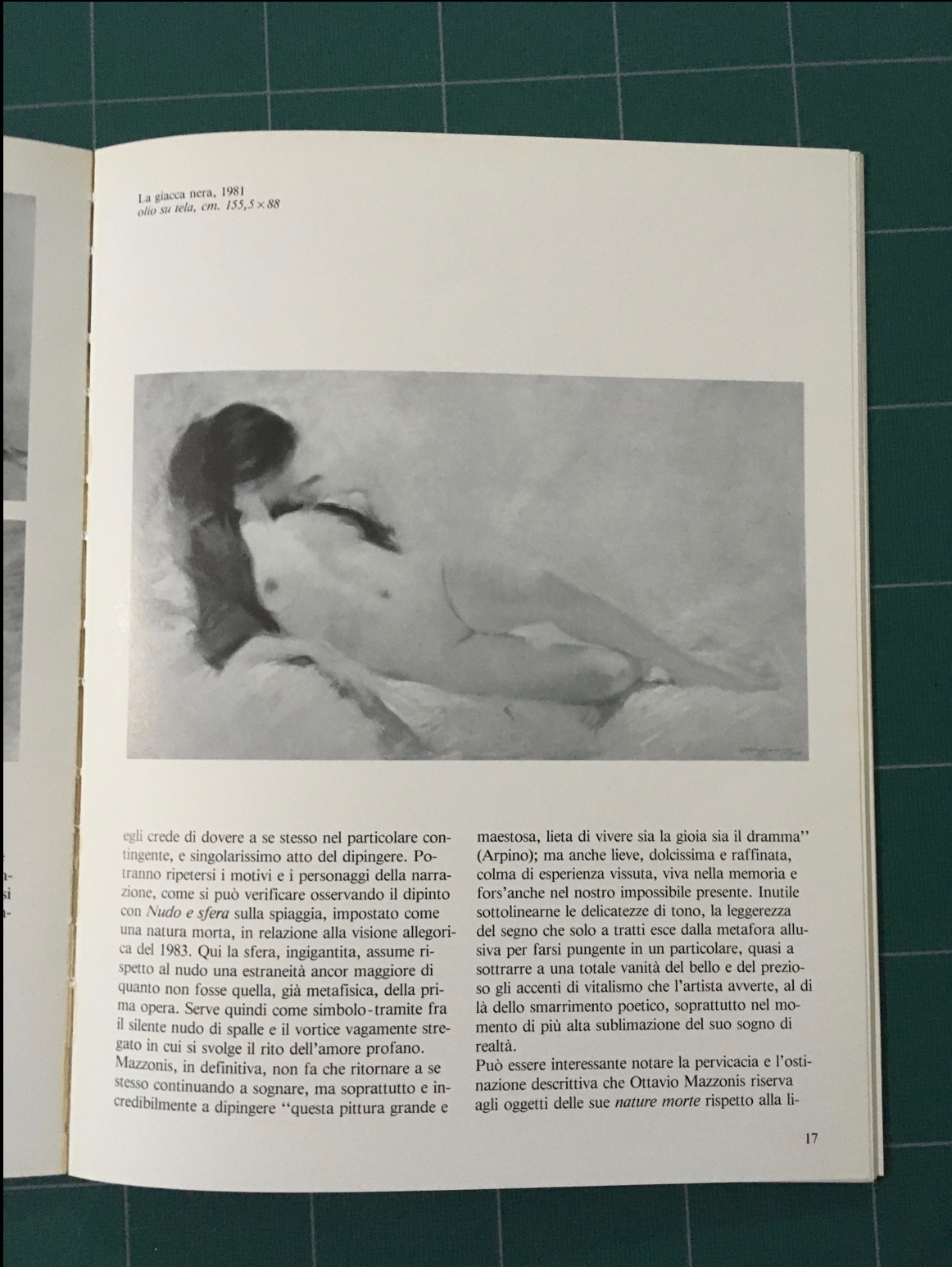
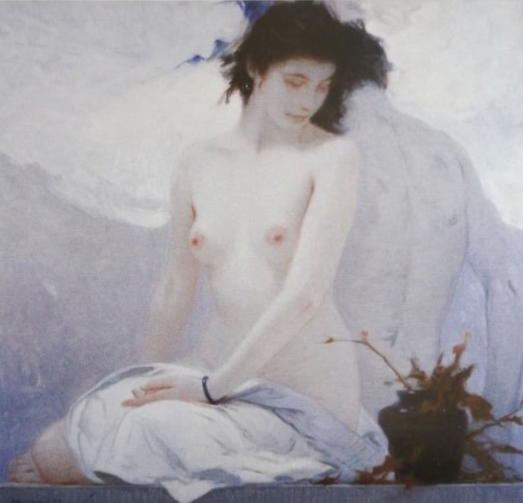
Mazzonis
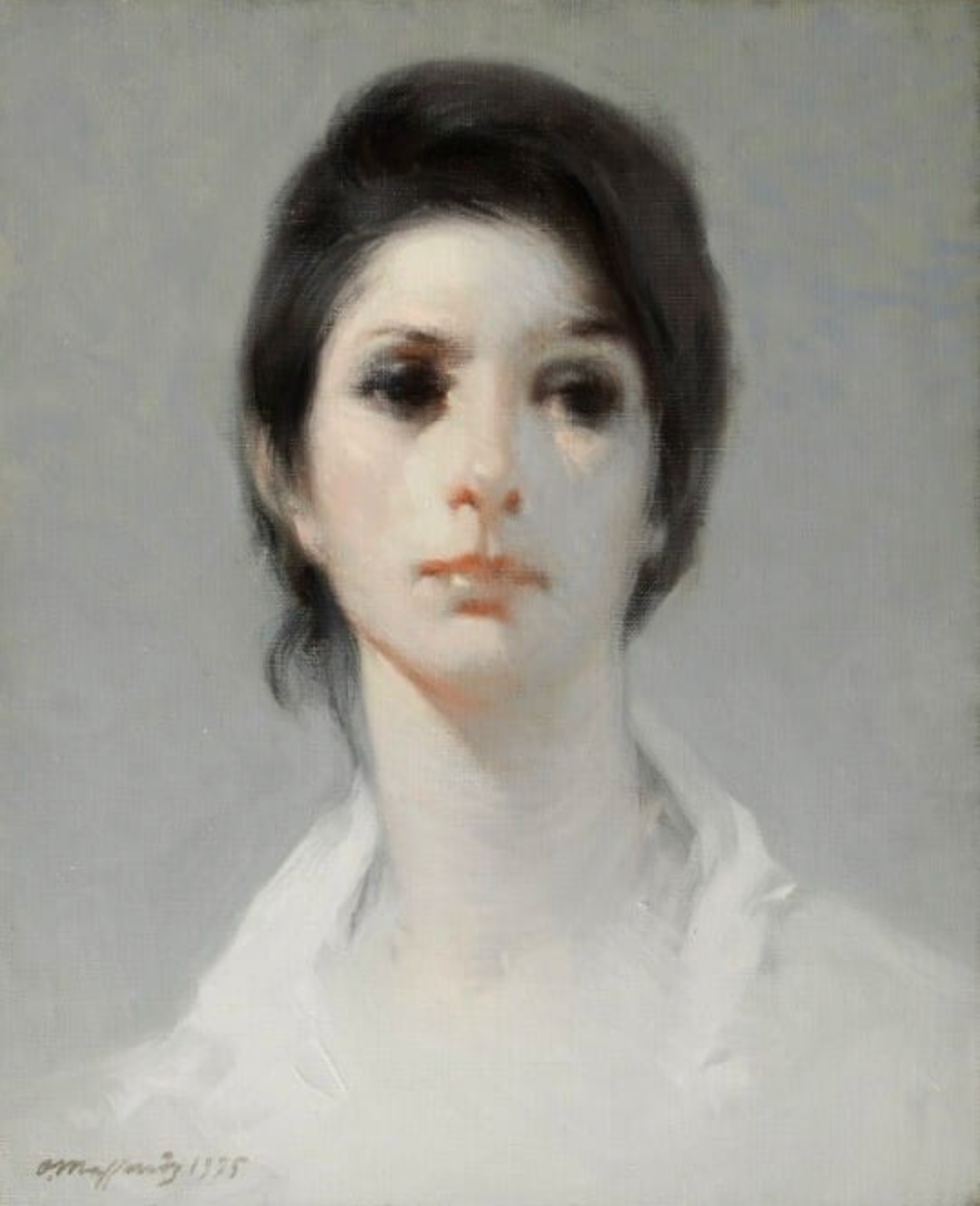
I wanted to share some inspiration from an artist I discovered recently – have you seen the work of Ottavio Mazzonis? I saw a painting by him randomly in a YouTube video and had to find more! It’s very difficult to find high resolution examples of his paintings online. He has no Wikipedia and his website has disappeared from the Internet, so I resorted to buying a catalog book of his work in Italian… I thought you might also enjoy the few examples I could find online, something about the compositions made me obsessed! Now that I think about it, there’s some overlap in your work on Threadbare with his use of fabric as a design element.
Thanks!
Thanks again, Lane! Your last feedback video and all of the Patreon content has been awesome. Loved the long study video emulating Sargent and the recent study in pink.
By the way, if anything comes up in this 1:1 coaching that would be useful to repurpose for a Patreon post I’m happy for my own work to be shared if it’s helpful. Also, I shared a quick testimonial on Instagram for your coaching and Patreon, hoping some of my local life drawing community will join! This weekend I’m co-hosting a fantasy themed costumed life drawing session with Carli Ihde. We’ll have members of the local sword academy (?!) wielding swords and wearing armor… more updates soon!
–Kevin