Wisconsin Refugees Development Notes
As I wrote about in the sister note to this post, I recently made a data visualization project exploring refugee resettlements in Wisconsin.
For the programming-curious and development-minded out there, here’s how I built the visualization, and here’s the GitHub repository.
The data
The data came from the Refugee Processing Center Database. You can see a PDF of the report I used here.
First I exported the data in CSV format from the Refugee Processing Center website. I cleaned up some of the headings in the CSV file to make them more readable than the default headings in the export.
For those not familiar with CSV, it means comma separated values, and it’s a plain text format where values are… well… separated by commas. Basically a spreadsheet with columns and rows, but everything is separated by a comma to mark a new column:
state,calendarYear,cumulativeInState,nationality,totalByNationality,destinationCity,yearlyNumberByCity
Wisconsin,2002,214,Afghanistan,25,Hartland
Wisconsin,2003,242,Afghanistan,13,Hartland
Wisconsin,2004,"2,414",Afghanistan,10,Hartland,0
Wisconsin,2005,"1,170",Afghanistan,1,Hartland,0
Wisconsin,2006,330,Afghanistan,1,Hartland,0
Wisconsin,2007,353,Afghanistan,9,Hartland,3
Loading the data
Now that I had a clean copy of the data in CSV, I needed a way to interact with it programmatically. I knew I wanted this to be a web page, and despite my progressive-enhancement-loving tendencies I decided to build frontend only to get the project moving quickly.
The state of the art JavaScript data visualization library is D3 so off I went to build an HTML page and load D3.
D3 can convert CSV files to a JavaScript array easily like so:
d3.csv('/data/2002-2017-wisconsin-refugees-arrivals-by-destination-and-nationality.csv', function(d) {
  // d is now the data from the CSV file in an array
  var data = d;
});
Cool, now I can start to slice and dice the data!
Slicing and dicing
The next step was to sketch out a series of functions that I would likely want to use later to see specific portions of the data. I wanted to be able to see the data for specific years or year ranges and for a specific country or list of countries.
Side note: this is something I’ve learned recently as a practicing developer—to get more efficient at building a project, sketch out the API (the set of functions you write to call upon later) right at the beginning. Imagine the set of functionality that you need to have at your disposal and outline it. It seems obvious, but in the past I would often focus on getting one thing to work at a time and build from there. Focusing on the big picture not only means you’ll finish more efficiently, but the code will likely be more modular and flexible from the start. Really subtle difference, but useful to practice.
I wrote individual functions to filter the data for specific years or nationalities, a larger query function that called those functions so I could search by year and nationality at the same time, and then a few helper functions for converting data between objects and arrays or pulling out specific values such as just the list of nationalities of the resulting data.
Using these functions, I was able to do all of the searches I needed to do just by calling the query function. Now it was time to display the data!
Displaying data
I like to get things working in as simple a way as possible at first, so to begin with I took the data from the query function and wrote it to text on the HTML page. It wasn’t yet my ultimate goal of displaying the data on a fancy map, but it was a display of data which is a great first step.
After that I had two directions I could go in: either start displaying the data visually on a map, or build a user interface so I could make new queries through the web page rather than in code. I chose to work on the mapping first since it was more difficult and therefore more fun.
Maps
After lots of research, lots of trial and error, and several pots of tea, I was able to display a map of Wisconsin using the very interesting and still slightly confusing combination of D3 projections and GeoJSON data.
I had never worked with GeoJSON data before, but it’s very cool. Essentially you can store your geography data the way it’s most easily readable and obtainable: latitude and longitude values. Then, you can use a “projection” to convert those values into a specific mapping of values on an SVG box on a web page.
This is amazing because it means I can store a map of Wisconsin using latitude/longitude values, and the locations of cities in latitude/longitude values, and not have to manually convert those values to coordinates in the SVG box. Very useful, but slightly confounding setup process if you haven’t done it before.
The GeoJSON data for Wisconsin was readily available online, so I copied it and loaded it into the project. I wasn’t able to find a GeoJSON file of the locations of all the cities in Wisconsin however, so I’m embarrassed to say I looked up the 81 cities in the dataset manually and recorded their latitude and longitude values. A quiet voice in the back of my head told me I could easily connect to something like the Google Maps API and get the data programmatically, but another voice in my head said that might be a distraction from the main problem at hand. If I were to expand this to other states or if the dataset changes in the future, however, I will certainly do that much wiser route.
With all of my geographic data at hand, I connected it to the refugee resettlement dataset and I placed a circle on each city where refugees had settled. Then I varied the size of the circle based on the number of refugees who settled there. This quickly became a design problem, because Milwaukee has had way more refugees resettle there than the rest of the state. The proportion difference was so great that most circles simply disappeared off the map because they were too small. I accounted for this problem by placing a default border around every circle. It skews the perception of the difference of the data based on size slightly, but at least you can see every location.
I also explored several other options for displaying the data, including color variation rather than size variation and displaying circles based on population density rather than total population. In the end I decided the first approach was simpler and better.
Refactoring
I was getting to a point where I had a lot of code, so at this point I reorganized into more modular, object-oriented pieces of code. I made objects for a View, a Query, and some DataUtils to store my data converting functions in one place.
User interface
The data visualization was in place, but the page was just a map in the middle of a page. There was no interface for interacting with the data through the page itself.
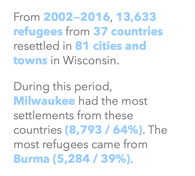
So, I started to add to the page layout, first a heading at the top of the page, and an alternative display of the data, a block of text that summarizes the data shown on the map and updates as the query is changed:
Then I added form elements to the HTML page, such as a dropdown to select a specific nationality to view and a slider to select a range of years (using this JavaScript slider since HTML doesn’t have a built in two-handled slider).
I connected these elements to the functions I had previously written to query the data, and confirmed that they updated the display of the data when they were changed!
Refinements and more refactoring
The rest of the work was detail oriented, building on top of this foundation. I improved the mobile layout, fixed some weird display issues during certain queries, added some extra data display boxes to the text display, cleaned up messy code, and got it ready for sharing.
At this point the code could still use some refactoring and cleaning up, but everything is working more or less as it should. Again, please see the sister post to this one for more thoughts about the content of the visualization itself. Happy coding!
Published

Kevin McGillivray is a web developer, painter, and writer in Wisconsin. He writes about creativity, online and offline neighborhoods, and vegetables. He paints and dives.